Site Redesign 2014

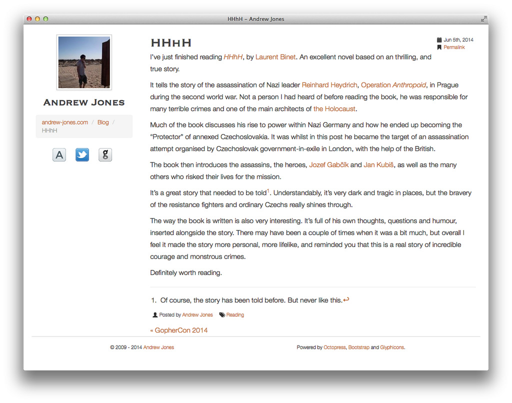
After a few years with the same design, I fancied a change. This is how it looked previously1:

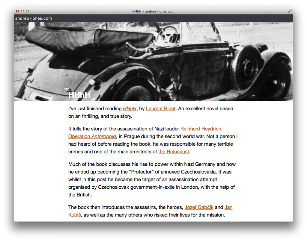
And now:

Design
The design has obviously been inspired by sites like Medium, with the banner image, and also by this excellent post on designing blogs for readers by Matt Gemmell. Other sites which inspired me include (in no order):
I used 0to255 to help choose my header colour, while keeping the orange from before (at least for now; I’m not sure if I’ll keep it).
The social icons at the bottom are from the excellent iconmonstr.
Hopefully you will agree the new design is cleaner, with less clutter and a focus on the content.
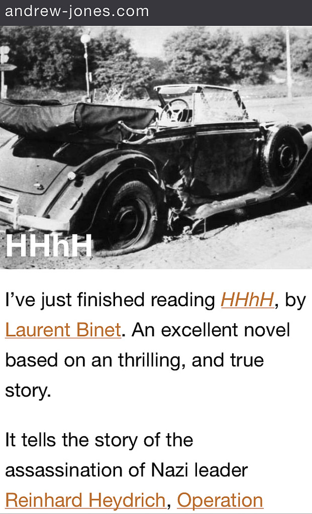
Of course, it is responsive. Here is a screenshot from an iPhone 5S:

Looks great on tablets too.
URLs
I also took the opportunity to change the URLs. They no longer contain the date in them, just the title. Of course, there are redirects in place, so old URLs still work.
In fact, I have changed URL’s so often, I have written some automated tests to ensure I don’t break them.
Generator
As part of this move, I migrated from Octopress to Hugo. I was never that happy with Octopress. It’s slow, bloated and difficult to use.
Hugo is very fast. Still a bit difficult to use, but it’s a young project, so it will hopefully improve.
I wrote a little Perl script to convert my content, and published it on GitHub. I should emphasise it converted my content; it is not likely to work for anyone else without some tweaks.
Work still to do
Redesigning my site has taken me ages. I just don’t have the free time these days. There are still a number of things I need to improve with this new design, including:
- Syntax highlighting
- Concatenate and minify CSS and JS
- A sprite for the icons
- Possibly remove the use of jQuery (I’m not using it for much, and I want to keep the site light on JS)
- Search (if needed?)
Still, I just had to get this out the door, so I can start using this blog again2.
I’m pretty happy with the new design. Let me know if notice any problems.
Cover image from Unsplash.